Interface redesign
The interface redesign
A redesign of the shopper's screens, four faults it uncovered, and the result of every test.
Abad Naseer · 8 August 2026 · measured on the development server, 25,631 products
A redesign of the shopper's interface, and four faults the redesign uncovered. All of it is built and running on the development server.
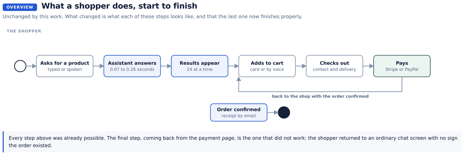
The instruction was to improve how the product looks and feels without changing what it does. Nothing a shopper could do before has been removed. What changed is how it looks, how it is arranged, and that one part of it now finishes properly.
Every screenshot is real. The "before" images were produced by rebuilding the previous version and photographing it in the same browser, at the same size, on the same day, so the pairs differ only in the thing being shown.
| Environment | Development server, marketz.smartzees.com |
| Catalog | 25,631 products |
| Measured | 8 August 2026 |
| Automated tests | 118 before, 128 now |
A shopper could pay, and then be shown nothing to say so.
Stripe and PayPal both send the shopper back to the shop once they have paid. The shop was not reading the message that came back with them. So a shopper who had just paid landed on an ordinary chat screen: no order number, no summary, no receipt on screen, and their basket still sitting there full of everything they had just bought.
The natural thing to do next is pay again.
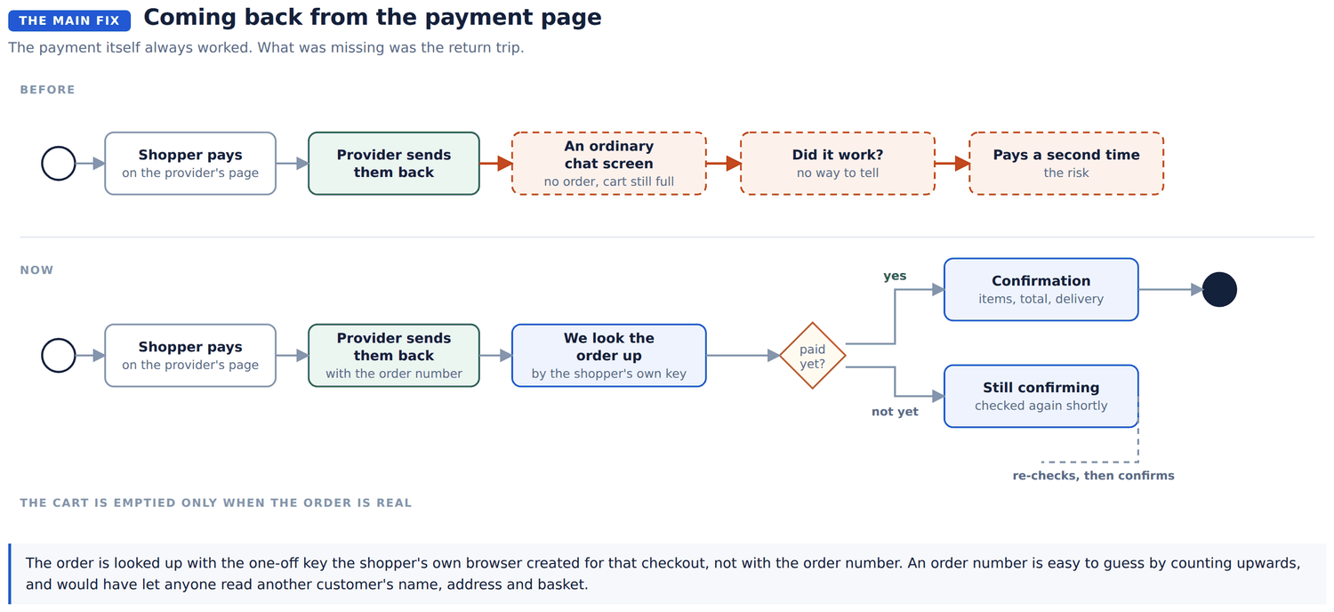
The return is now handled. The order is fetched and shown with its number, its items and its total, and the basket is cleared. A shopper who abandons the payment page instead is told plainly that nothing was charged, and their basket is left exactly as it was.
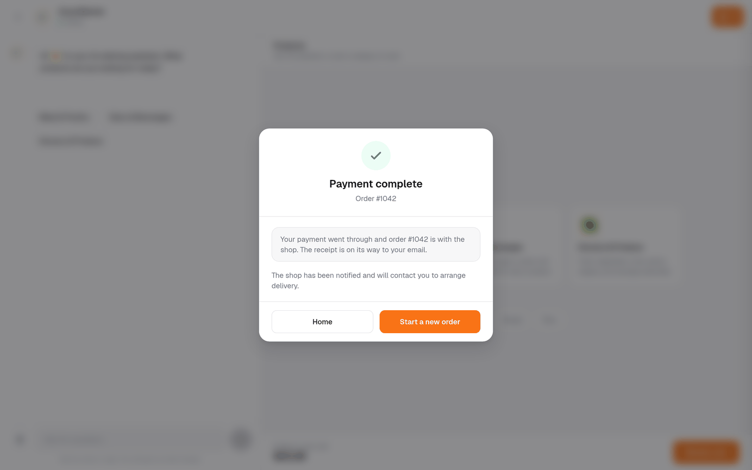
*Returning from the payment page. This is the version shown when the order details cannot be fetched: it still states plainly what is certainly true.*
On security. The order is looked up using a one-off key the shopper's own browser created for that checkout. It would have been easier to look it up by order number, and that would have been a mistake: order numbers run 1, 2, 3, so anyone could have typed a different number and read another customer's name, address and shopping. Ten automated tests hold that door shut, including one that checks the order number is refused.
About four products in ten have no photo on the supplier's system. Nothing here can change that. What can change is what the shopper sees in the gap.
They were seeing the browser's broken image icon, which does not say "no photo available". It says "this shop is broken".
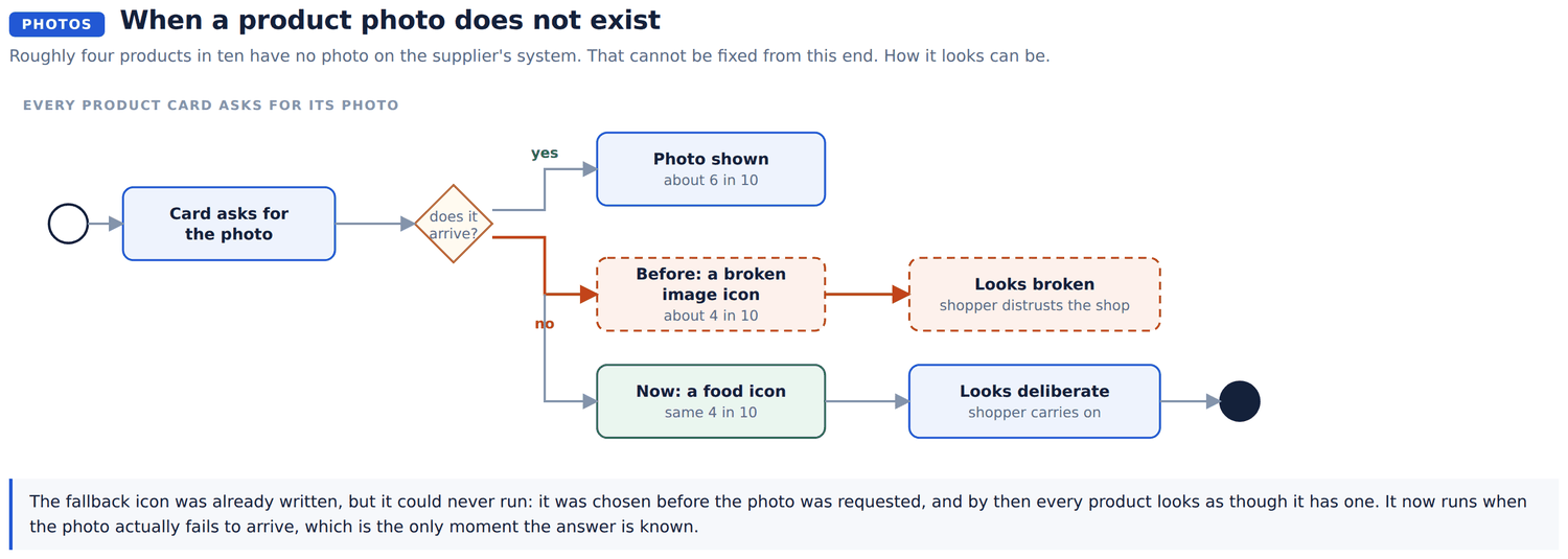
A food icon now takes the place of a missing photo. It reads as a deliberate choice rather than a failure. Counted on one search: 52 broken images before, none now.
The assistant says "here are the best matches" and lists five. The screen behind it was drawing every single match: 412 for "milk", 634 for "chicken", each one asking for its own photo. That is 824 photo requests from one search for chicken.
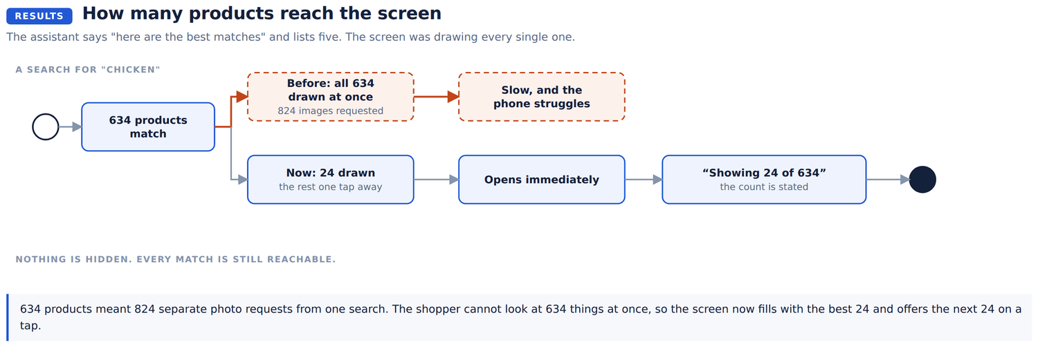
The screen now fills with the best 24 and says how many there are in total. The next 24 are one tap away, so nothing is out of reach.
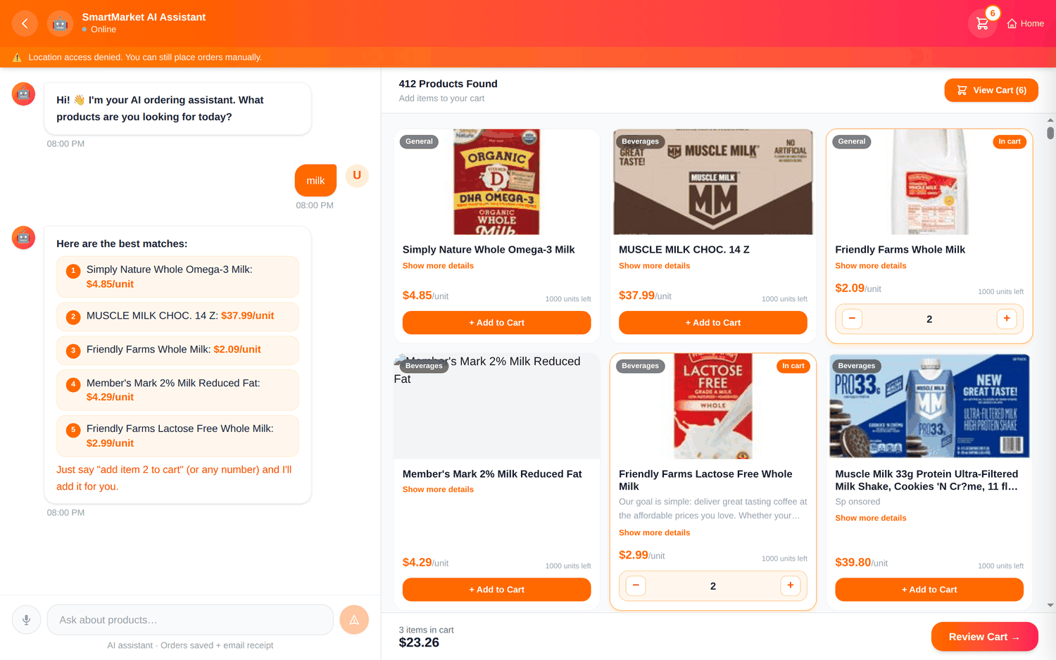
*Before. Every match drawn at once, broken image icons among them, a warning strip about location under the heading, and prices reading "$4.85/unit".*
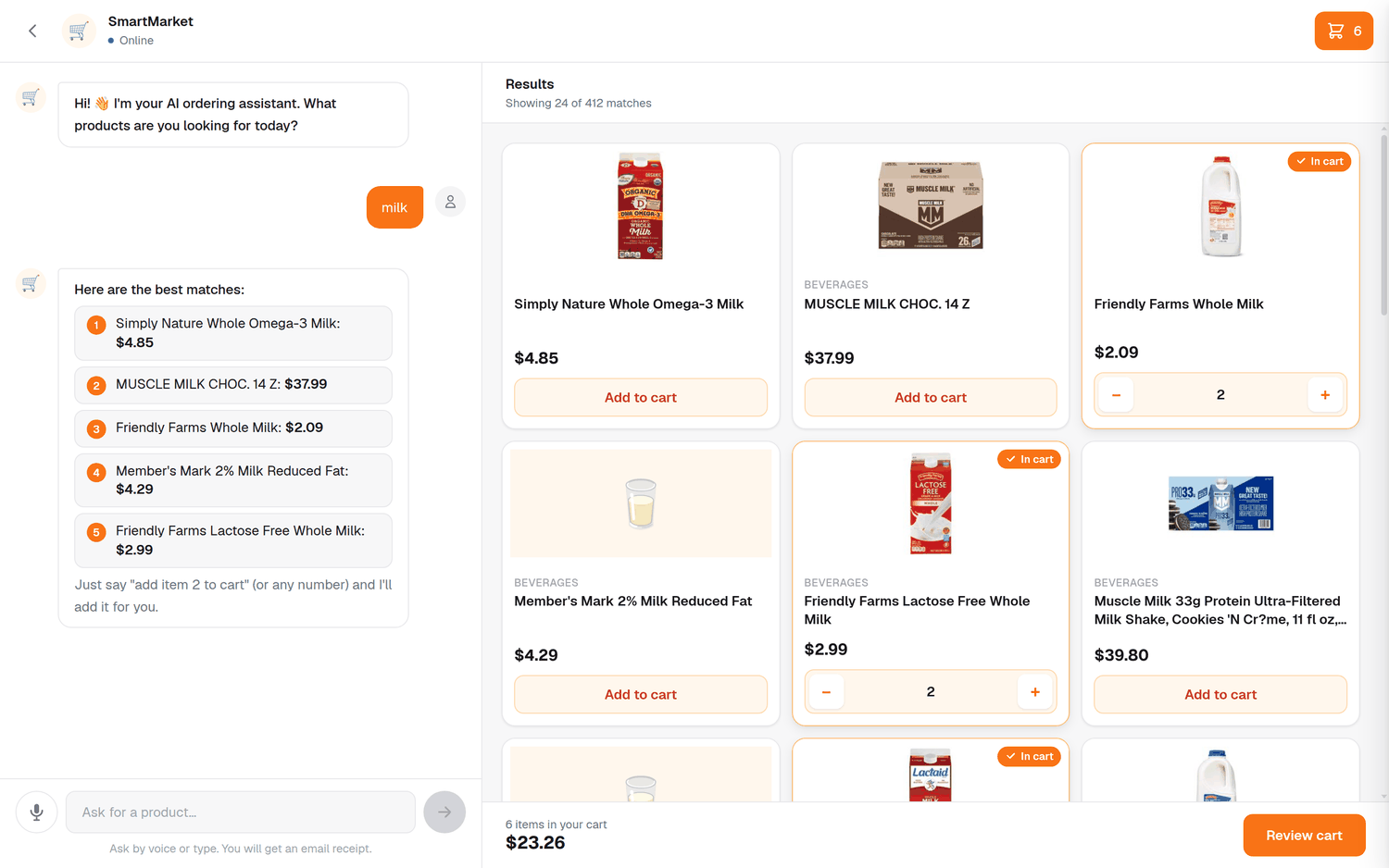
*Now. The best 24, with the total stated. Missing photos show a food icon. Cards line up, so the eye can run along a row.*

*Before. Three different products, three identical trolley icons.*
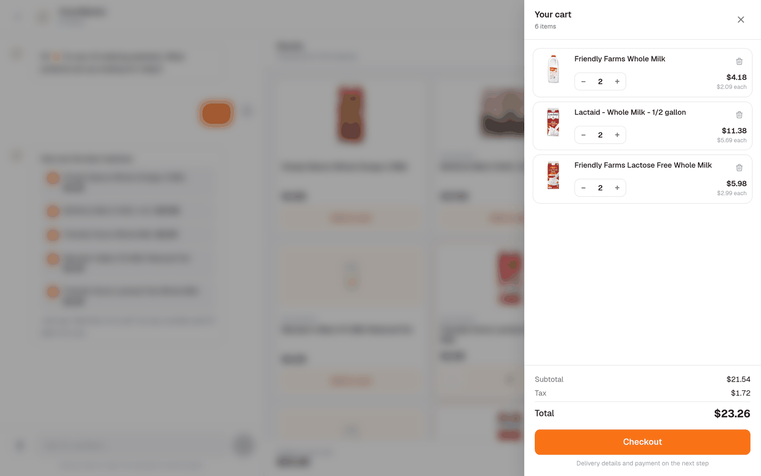
*Now. Each line carries its own photo, so the basket can be checked at a glance.*

*Contact and delivery are now separate groups, and the shopper is told which payment methods are coming before they fill anything in.*
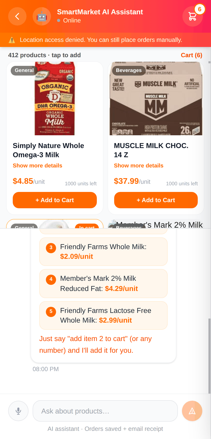
*Before. Products and conversation shared the screen, so the products were cut off halfway through a row and the conversation had what was left.*
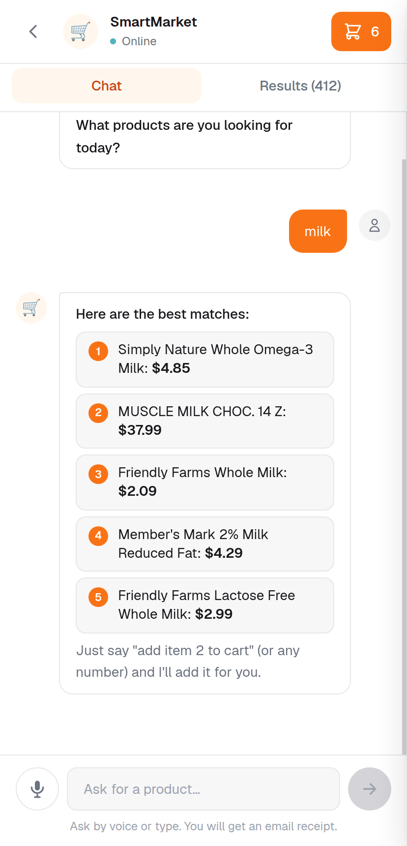
*Now. Two tabs. The typing box and the microphone stay on screen in both, so the assistant is never more than a tap away.*
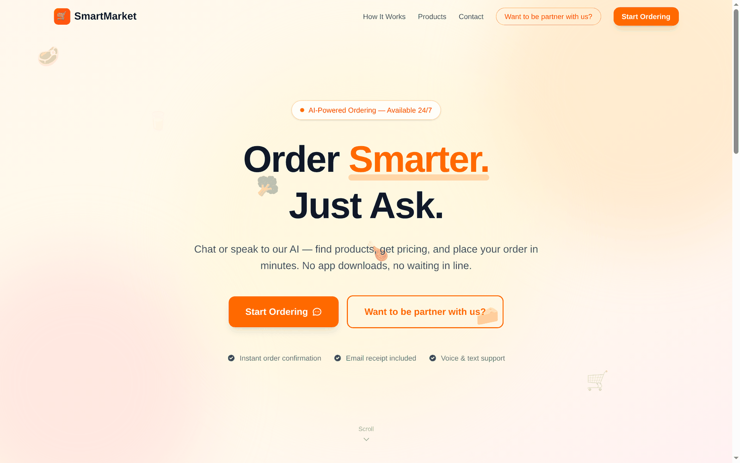
*Before.*
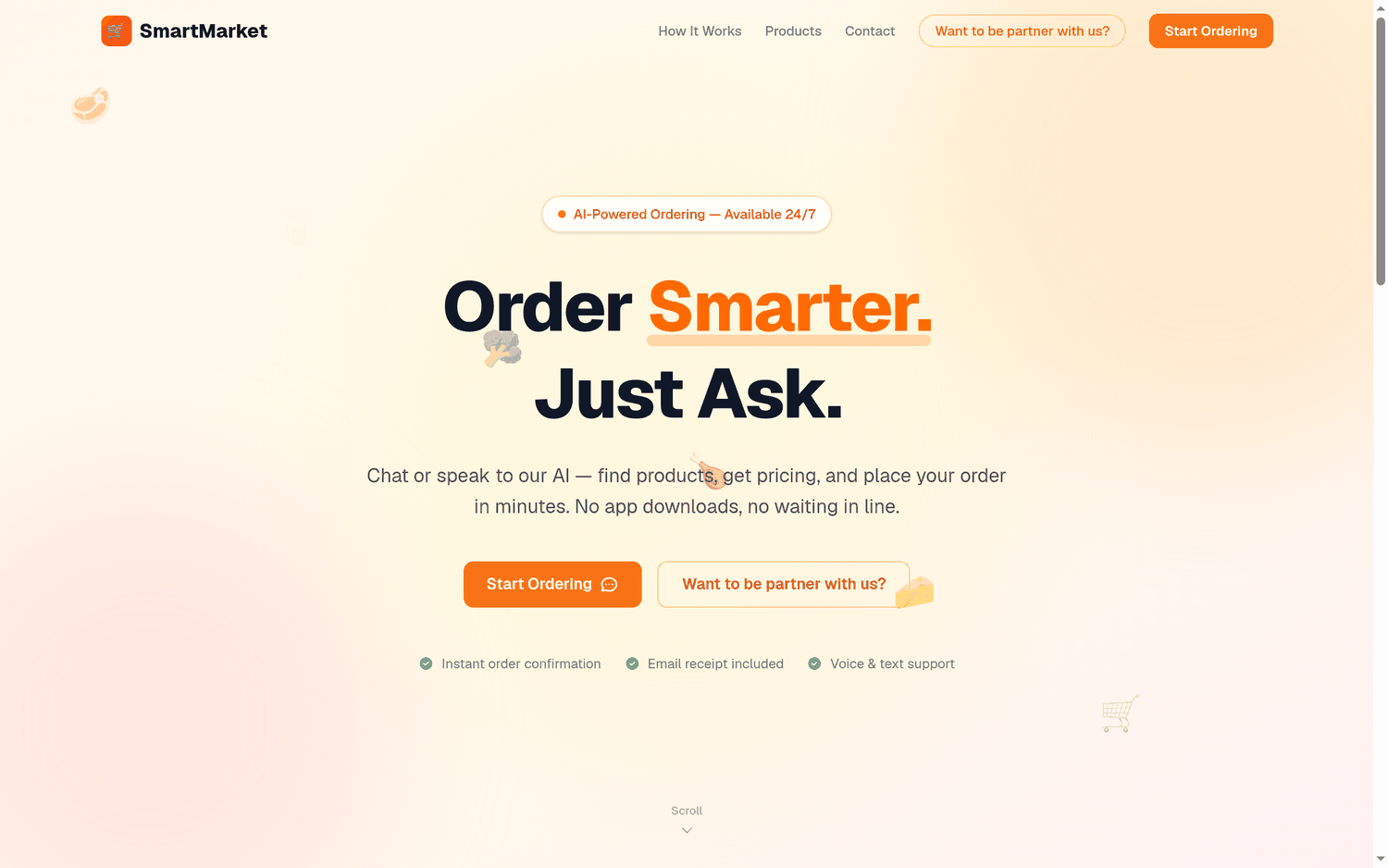
*Now.*
Three things were changed, and one of them explains most of the difference.
The typeface was being thrown away. The site loads a typeface called Geist, and then a single line of styling further down told the browser to use Arial instead. So the typeface was downloaded on every visit and never seen. That line is gone. This one change is most of the reason the product now looks finished.
Orange is now used for one thing at a time. It was the background of the header, the basket, the checkout panel and every button at once. When everything is the loudest thing on the screen, nothing is. Orange is now kept for the single most important action on whichever screen the shopper is looking at.
Sizes and shapes now come from one list. Text sizes, corner roundings, borders and shadows were each being chosen separately in each place they appeared, which is why the screens did not quite look related. They are now defined once and used everywhere.
The catalog carries some placeholder values, and the screen was presenting them as fact.
| Shown before | The reality |
|---|---|
| "$4.85/unit" | Every product in the catalog says its unit is "unit". It is a placeholder, not a measure. |
| "1000 units left" | 628 of the 634 chicken products say exactly 1000. It is a default, not a stock count. |
| A category badge reading "General" | 106 of those 634 sit in a bucket called "General", which tells a shopper nothing. |
| "Sp onsored" | A product description that is the word "sponsored" split across a line break. |
| A coffee description on a bottle of milk | Cut off mid-word, at "we've got you cove". |
None of these are now shown. Where the real value is known, it is displayed: a genuine unit such as "kg" still appears, and stock is mentioned when it is genuinely low.
This hides the problem rather than fixing it. The values are still wrong in the catalog itself, and correcting them is a separate piece of work on the product data. It is worth doing: real units and real stock counts would let the shop say useful things instead of staying silent.
| What was checked | Result |
|---|---|
| Full automated test suite | 128 passed, up from 118 |
| Order lookup returns the right order | Pass |
| Order lookup refuses the order number | Pass, this is the one that protects other customers' details |
| Order lookup refuses a guessed key | Pass |
| Order lookup refuses an order placed without a key | Pass |
| Returning from a payment shows the confirmation | Pass |
| Refreshing afterwards does not repeat it | Pass |
| A cancelled payment says nothing was charged, basket kept | Pass |
| Missing photos show a food icon | Pass, 52 broken images before, 0 now |
| A search for chicken draws 24 cards, not 634 | Pass |
| "Show more" reveals the next 24 | Pass |
| Basket lines show their own photo | Pass |
| Phone tabs, with the typing box on both | Pass |
| Type checking and code linting | Clean |
| Assistant, search, basket and checkout still work | Pass |
Two things are honestly outstanding.
A real card payment has not been driven from end to end. Everything up to the payment page is verified, and the screen a shopper returns to is verified. Entering a real test card needs a person at a browser.
The itemised confirmation was verified in the parts, not as a whole. Placing a test order on the development server would have written that order into the live shop database, because the two are connected, so it was not done. The lookup behind it is covered by the automated tests above, and the screen itself is the same one the existing non-payment checkout already uses.
An earlier note said the front page ran off the side of the screen on a phone. That was wrong, and it is worth saying so plainly.
It came from a first pass that photographed the page without telling the browser to behave like a phone. The image looked cut off, but the page itself was not. Measured properly, the page fitted the screen both before and after.
There was a real problem on that screen, and it is visible below: the decorative food icons floated on top of the text, so a broccoli sat in the middle of a sentence and a piece of cheese sat across a button.
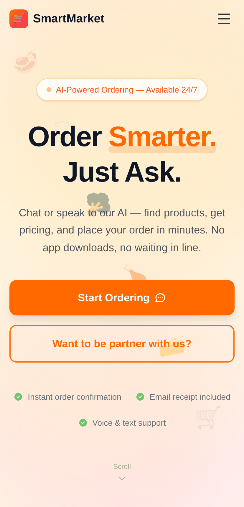
*Before. Look at the broccoli over the paragraph and the cheese across the second button.*
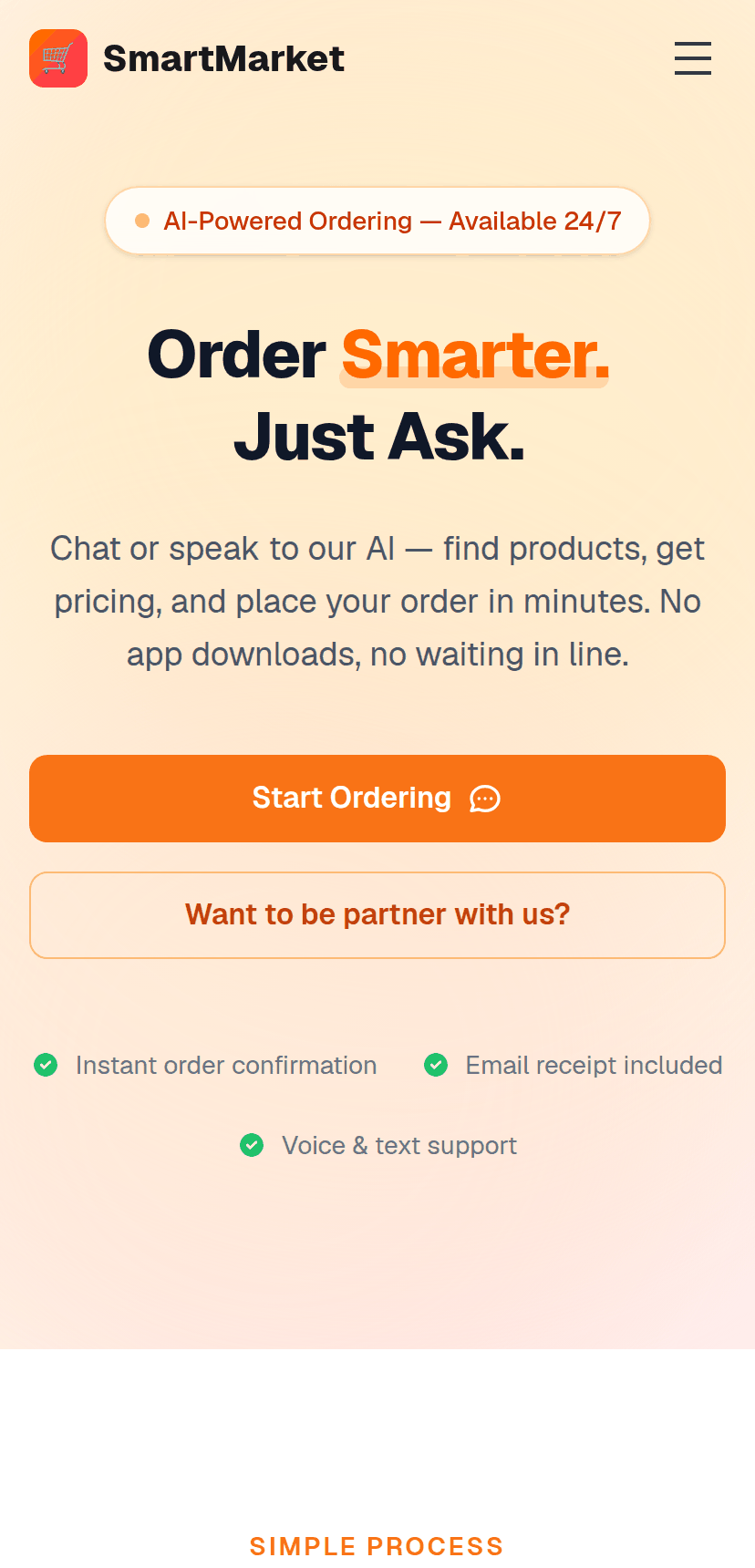
*Now. The decorations are hidden on small screens, the heading is sized for a phone, and the page no longer opens with a screen and a half of empty space.*
| Before | Now | |
|---|---|---|
| Paying and coming back | No sign the order existed, basket still full | Confirmation with order number, basket cleared |
| Risk of paying twice | Real | Removed |
| Missing product photo | Broken image icon | A food icon |
| Products drawn per search | Up to 634 | 24, with the total stated |
| Basket lines | Same icon on every line | Each product's own photo |
| Typeface | Downloaded, then discarded | Used |
| Placeholder data | Shown as fact | Not shown |
| On a phone | Two panes fighting for the screen | Two tabs |
| Automated tests | 118 | 128 |
Everything above is live at marketz.smartzees.com.